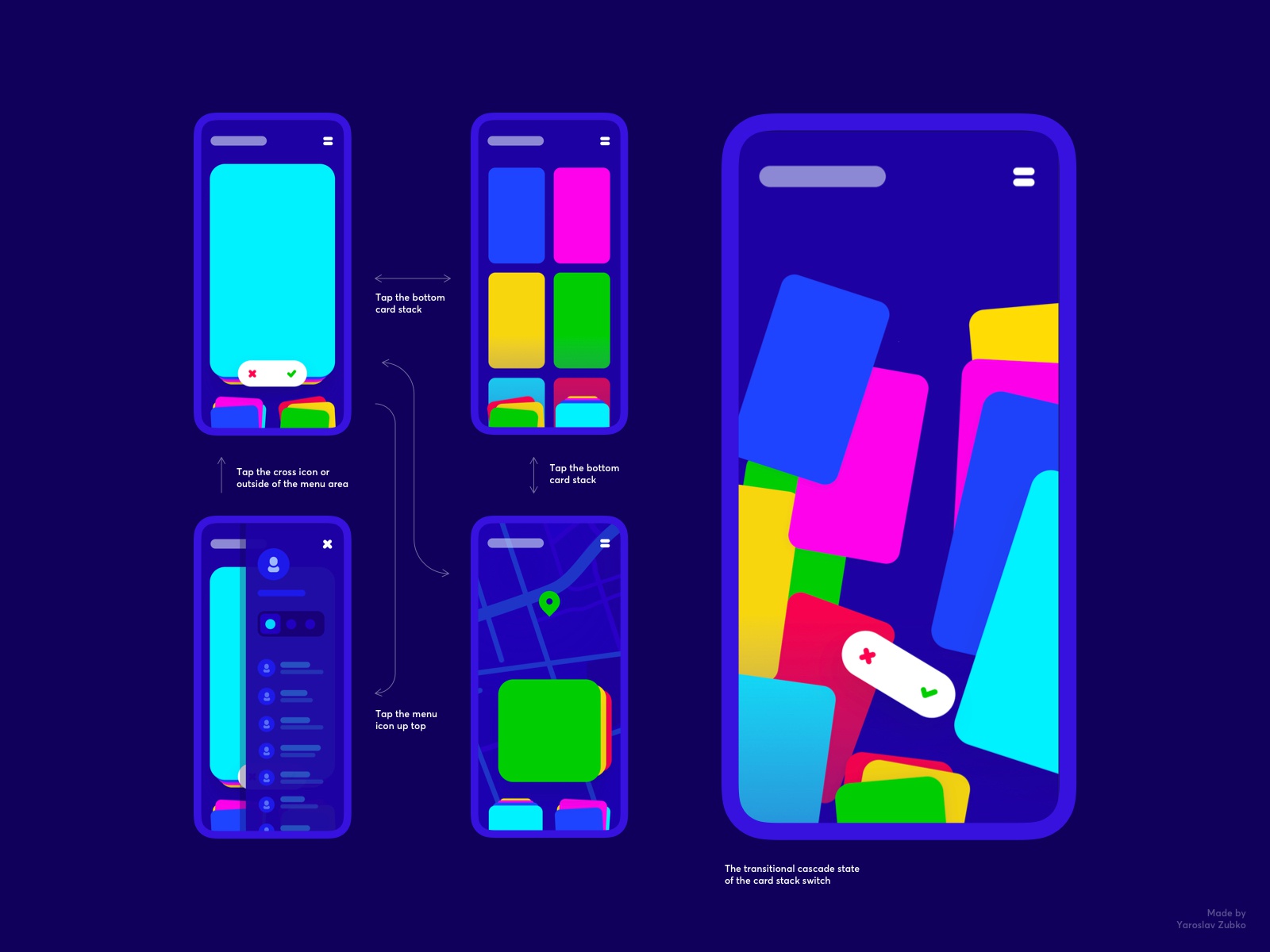
This interaction came to be as a result of my attempts to handle multiple card stacks in the mobile UI. You can find that the 3 types of card stacks are easily accessible through the bottom nav of sorts. Why give users symbolic iconography (as in a conventional bottom nav bar) if you can give them the actual stacks right away. This pattern is designed to bridge the gap between what users expect and what they get while navigating through a mobile application.
This post is a part of the ongoing project, “Interaction Library” where I post interesting and engaging human-machine interactions. All posts are tested for accessibility on a real device and are proven to be possible to build. My team and I are always up to a challenge so feel free to reach out for any design and/or development work.
I hope you find this content interesting. Hit “L” on your keyboard to show it! 🙂
>>访问dribbble查看高清大图


评论回复